Four tools. Zero visibility.
One engineer holding it all together.
Ramboll's HVAC project managers were coordinating live engineering projects across Maconomy, Excel, and Teams simultaneously. No connection between them. Every status update, budget check, and progress report assembled by hand.
Microsoft Teams
Microsoft Excel
Maconomy
Monthly Reports
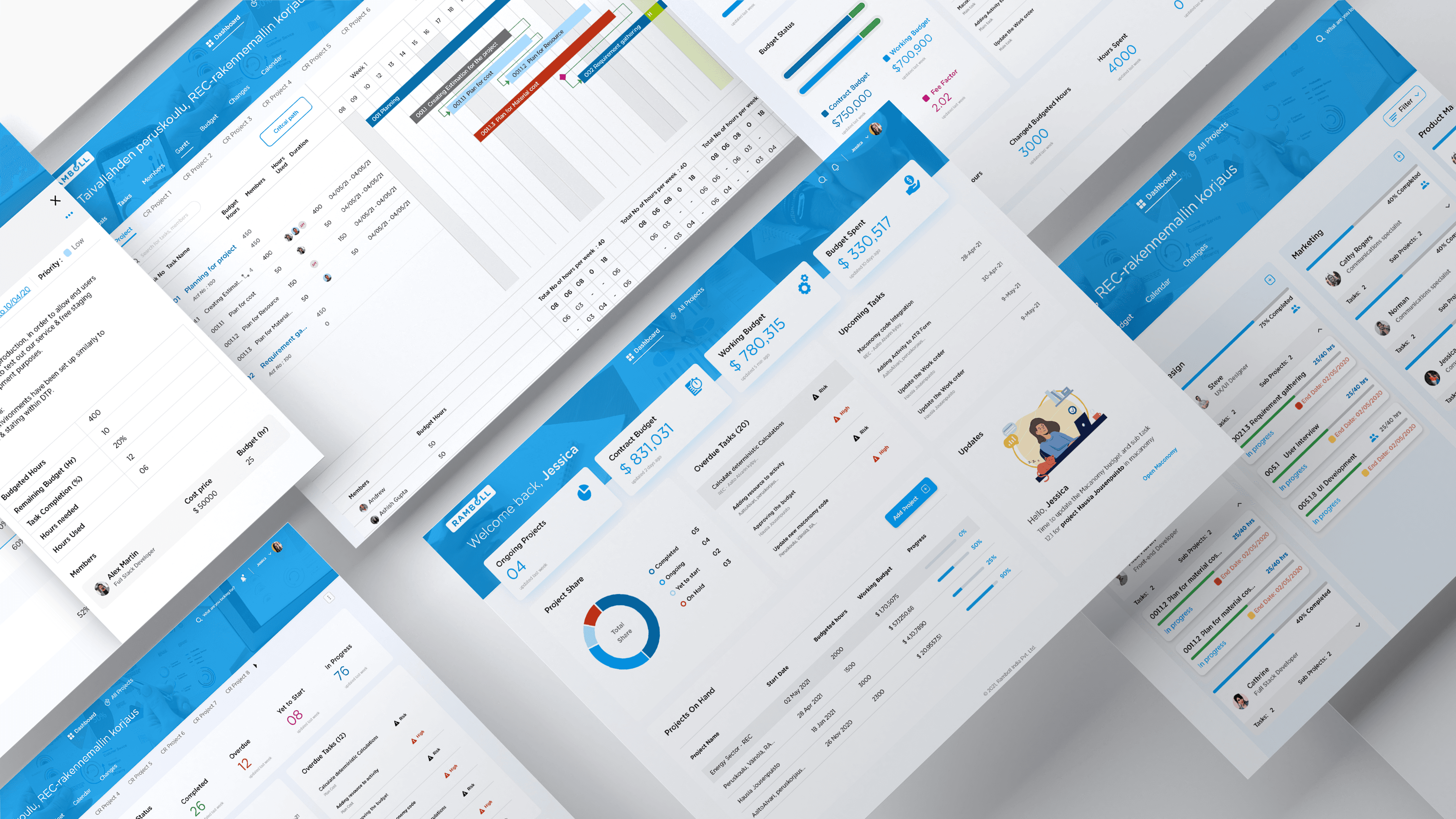
One unified tool
Project tracking, task hierarchy, Gantt and budget visibility all connected to Maconomy
AUTOMATEDThree steps that shaped every decision.
Step 01 — Interviewing managers before assuming
I talked to junior PMs, senior PMs, and project owners separately. Each session started the same way, walk me through your actual Monday morning. Not what they wished existed. What they actually did.
Junior Project Manager
Daily task execution across multiple projects at once.
Senior Project Manager
Budget control, risk and client communication.
Project Owner
Project outcomes and periodic stakeholder reporting.

It seems like an easy tool to use and easy to understand everything so it will be less time consuming than the old way with Excel and Maconomy.
The breaking down structure in the WBS tool is useful now. Assigning members to each sub task and sub sub task is useful now.
It has been a huge advantage noticing things if they are lagging behind or delayed. We can notice it much earlier now.
Step 02 — Testing the market before trusting our instincts
Before committing to building from scratch, I mapped ClickUp, Jira, and Monday against what Ramboll's PMs actually needed. Every tool solved part of the problem. The gap was always the same.



0
Tools reviewed before build
0%
Needs met by top option
0
Tools with Maconomy integration
Every tool we looked at failed on the same thing. None of them connected to Maconomy. Without that, PMs would still be in two systems. Building was the only option that closed the full gap.
Step 03 — Mapping the ideal week of a HVAC PM
Instead of documenting what was broken, I mapped how a PM's week should feel with the right tool. This became the alignment document. The PM, project owner, BA, and I used it to agree on what had to ship first and what would wait. The output was not a Figma file. It was a shared agreement on scope.
One of the earliest artifacts that helped uncover how four disconnected systems worked together.
We found more than we could fix.
These three came first.
Research surfaced a wide set of gaps. These were the problems specific enough, frequent enough, and painful enough to act on first.
PMs opened three to four documents every morning just to answer where a project stood. No single source of truth existed.
One screen showing every active project, its current status, and what needs attention before the first meeting of the day.
Maconomy supported one task level. HVAC projects needed three. The gap lived in Excel, outside the system of record.
A task structure that matched how HVAC engineers actually planned work, connected to the same system tracking hours and budget.
Budget overruns were discovered at month end during report assembly. By then it was too late to course correct.
A live view of hours spent and remaining, updated automatically, visible at any point during the project.
Research told us what was broken.
The harder question was what to build first.
We had more problems than one phase could solve. So we sat down with the PM team, mapped every potential feature, and made a shared call on what had to ship first.
Scope — Building the MVP with the PM team
I brought the research findings into a working session with the PM, project owner, and BA. We mapped each potential feature against user impact and build complexity. That conversation narrowed a long list down to six features committed for phase one.
Feature Priority Matrix - MVP Planning Session
High impact. Low enough complexity to ship. That was the filter.
Dashboard Overview
One screen. Every project. What needs attention today.
Three Level Task Hierarchy
Plan work the way HVAC engineers actually think. Phase, deliverable, activity.
Budget and Hours Automation
Hours spent and remaining, always live. No manual calculation.
Gantt Chart
Timelines built directly from tasks. Milestones and dependencies in one view.
Maconomy Import
Enter a project code. Everything else pulls in automatically.
Project Synopsis
One page per project. Keeps every stakeholder on the same picture.
Alignment — Validating user stories
Every story had to trace back to something real from the research. A junior designer and I worked with the BA to validate each one against the interview insights and the PM team's acceptance criteria. It kept the build honest.

Architecture — Information architecture for the full team
Before any wireframe I built a numbered IA covering every section of the product. The decimal system meant everyone in a standup was pointing at the same screen without ambiguity. It also gave the backend team a scaffold to think about data structure before any UI existed.

Three trade-offs.
One better experience.
Every decision traces back to something we found in research. Here is what was debated, what was hard, and what shipped.
01 - Dashboard View
Solves → Status visibilityThe most debated surface. The sketch showed everything stakeholders wanted. What shipped was an editorial call about what a PM actually needs before their first meeting.

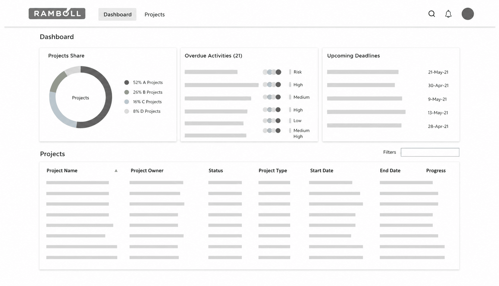


Empty state - the first thing a PM sees. One action, zero friction. Enter a project code and the tool takes over.

Final dashboard - only what needs action today. Stat cards, overdue tasks, upcoming deadlines, and a direct line to Maconomy.
02 - Task Hierarchy
Solves → Task structureMaconomy supported one task level. HVAC projects needed three. We built a hierarchy that matched how engineers actually plan work and documented every calculation so developers could build it right.
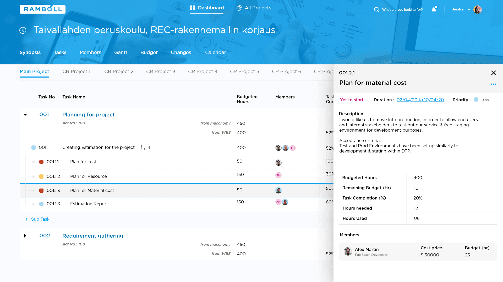
Task hierarchy screen - three levels of depth, hours calculated automatically, full task context in a side panel.

Before any line of code, I documented every calculation formula and presented it to stakeholders and engineers. This is what domain literacy looks like in practice.
03 - Project Synopsis
Supporting → Status visibility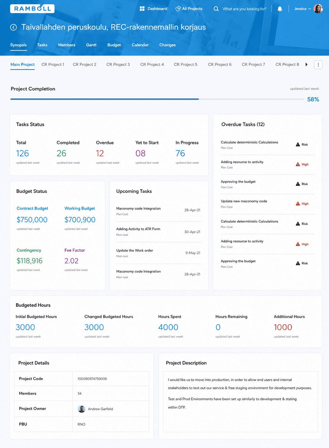
One screen that aligns every stakeholder before a client discussion. Completion, budget, risk and upcoming tasks with no manual assembly required.
04 - Members
Supporting → Task structure
The list view was faster to build. The kanban was the right design. We chose kanban because project managers think in disciplines and capacity, not alphabetical rows. Stakeholders aligned immediately. Dev shipped a minimal version in phase 1 and committed the full kanban to phase 2.
05 - Budget Awareness and Gantt
Solves → Budget awareness
Static UI with live Maconomy data. Full interactivity scoped to phase 2. Stakeholders preferred a designed view over an empty state.

Gantt built in collaboration with the frontend developer using a customised plugin. Critical path, colour coded status, and resource hours in one view.
Real users. Real feedback.
Here is what happened.
Remote usability testing with HVAC project managers and senior consultants. Specific scenarios, a working prototype, and feedback recorded live.

found the tool easy to use
completed tasks without hesitation
faster than the Excel and Maconomy workflow
reduction in manual intervention
How we tested
The method behind the numbers.
Method
Scenario based tasks
Real tasks, not free exploration. Scenarios matched their actual daily workflow.
Tool
Adobe XD prototype via Teams
Working prototype shared over Teams. Each participant completed tasks on their own screen, observed live.
Data collected
Behaviour, expressions and ratings
Facial expressions, hesitation moments, verbal feedback and survey scores recorded per session.
What users said
Unprompted. Specific. From the people who tested it.
The breaking down structure in the WBS tool is useful now. Assigning members to each sub task and sub sub task is useful now.
Senior Consultant | HVAC and Energy
The new dashboard gives us a clear overview of projects and status. So much easier to see exactly where we are and where attention is needed.
Team Lead
Easy to use and easy to understand. It will be less time consuming than the old way with Excel and Maconomy.
Senior Consultant | HVAC and Energy
It has been a huge advantage noticing things if they are lagging behind or delayed. We can notice it much earlier.
Section Leader | Energy and Environment
Not everything went right.
Here is what that taught me.
Three things this project changed about how I work.
01
MVP is a team decision, not a design deliverable
We committed to six features because we decided together as a room, the PM, project owner, BA, and me. When scope is owned by one person it is guessed. When it is owned by the room it holds.
Collaboration02
What you cut matters as much as what you ship
The kanban view, full budget interactivity, change management were all designed, all deferred. That was not failure. It was the right call made at the right time with the right people. Knowing what not to build in phase one is the hardest design decision on any product.
Prioritisation03
Domain depth is a design skill
I documented the hour calculation formulas and presented them to the dev team. That was not in my brief. But without that depth the feature would have shipped wrong. Understanding the domain is not extra work. It is the work.
Domain literacyNext Project