A tool engineers trusted.
An experience that let them down.
For a new generation of engineers expecting modern workflows, the experience felt fragmented because of too many steps, no continuity and limited visibility. Three friction points consistently slowed engineers down.
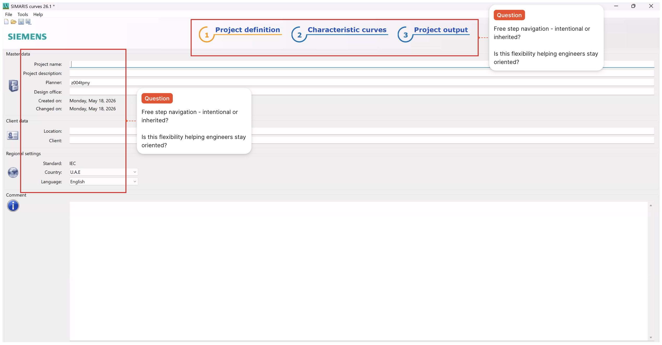
Engineers were required to complete full project setup before accessing curves which was making even quick comparisons unnecessarily heavy.
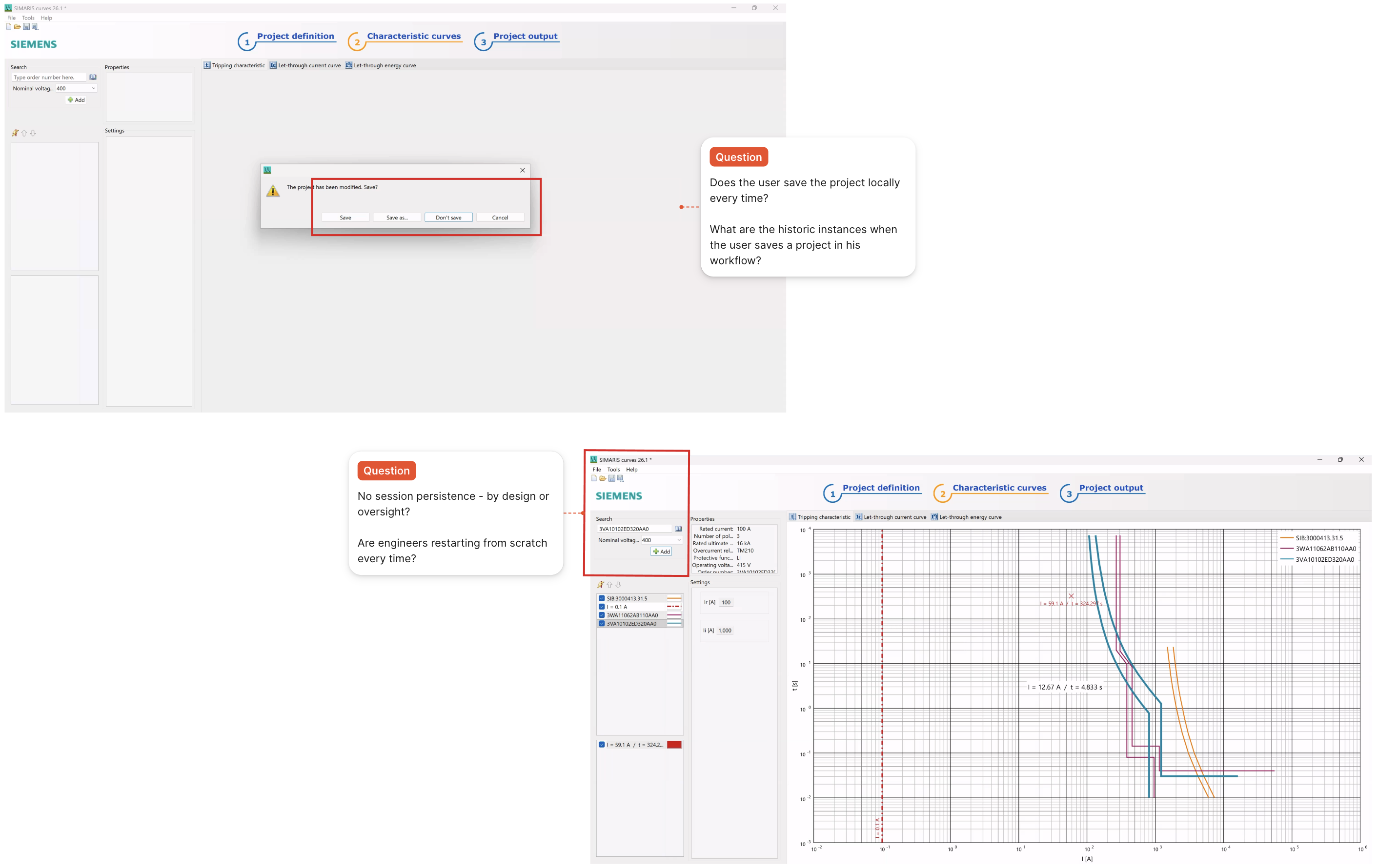
Configurations couldn't be saved, reused, or easily modified forcing engineers to restart workflows and manually re-enter data each time.
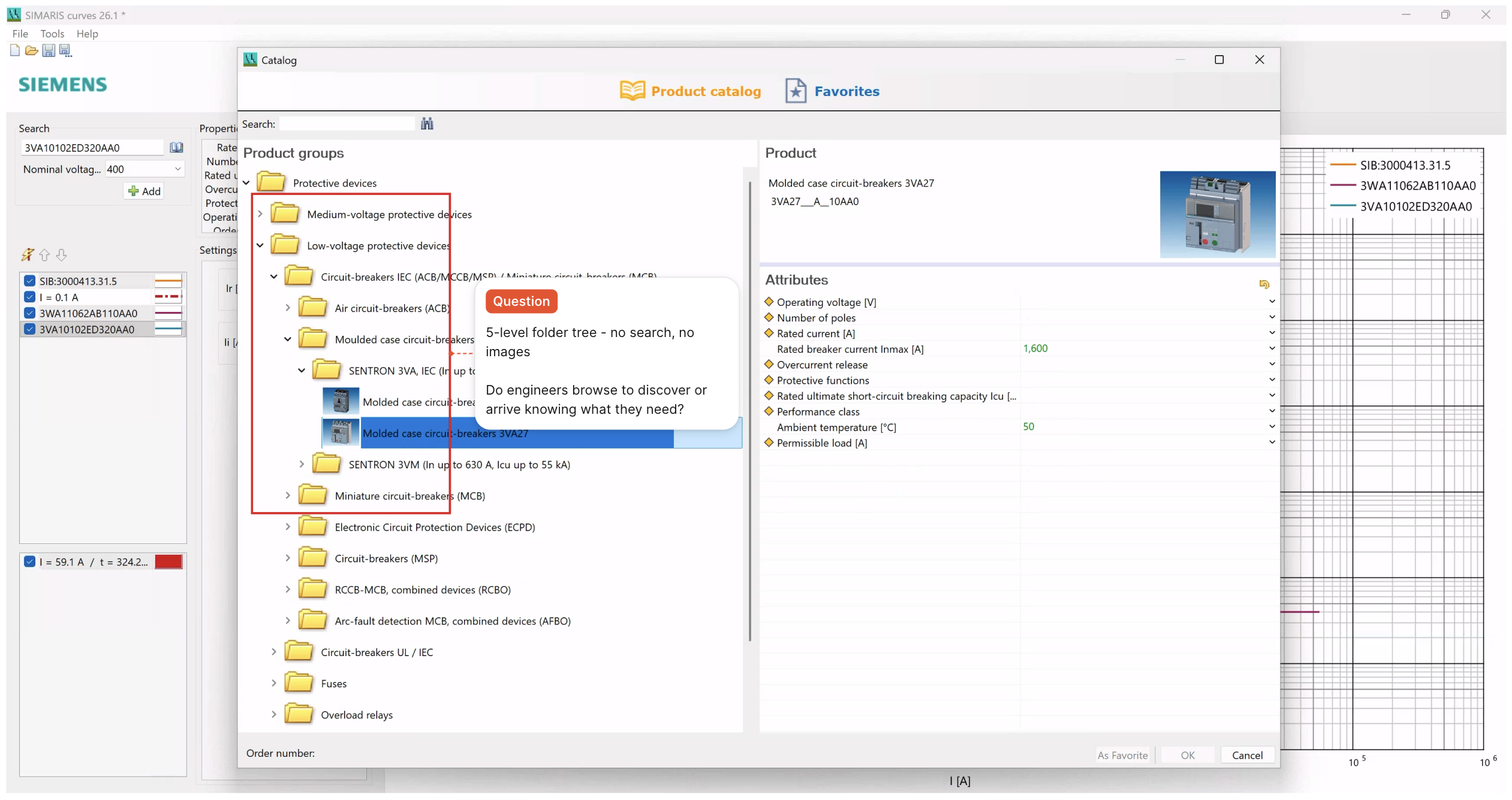
Engineers had to navigate nested folders step-by-step without being able to scan, compare, or validate options until the very end.
Four assumptions.
Four reframes.
Heuristic analysis and SME sessions challenged what we walked in with.
Three decisions that
reshaped the product.
What was expected, what I chose, and what it cost.
Each decision went through multiple iterations that was validated against SME feedback and engineering constraints across sprint cycles before it held.
Graph at the centre. Not the right.
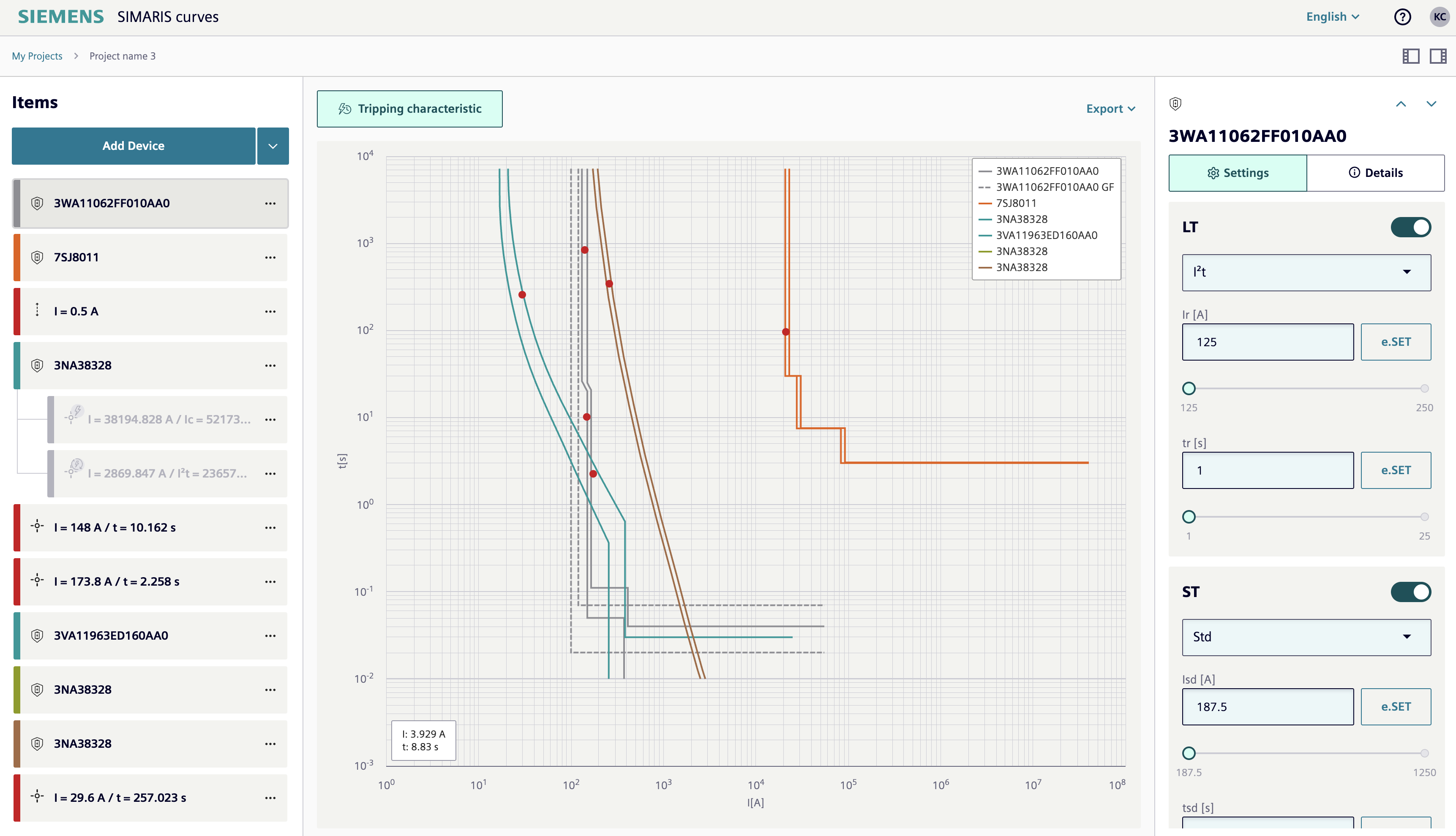
Two-column layout with panels left, graph right. Consistent with every Siemens tool in the suite.
Three-column layout with list left, graph centre, settings right. Graph gets the most space, the most prominence, the most light.
The graph is the product. The rest of the experience should quietly lead people there.
A deliberate deviation from the Siemens tool family pattern. Required a direct conversation with the design system team to justify and align.
Centring the graph changed the mental contract: settings become adjustments to something already visible, not prerequisites to something hidden. It also set the responsive hierarchy where graph was dominant at every breakpoint, panels subordinate.
Catalogue reimagined. Tree untangled.
Replicate the desktop tree structure. Same API, same folder hierarchy which was faster to build at lower risk.
Ecommerce-style card catalogue. Product images on landing. Categories as filters, not gates. MLFB search for experts.
A tree assumes you know where something lives. A catalogue assumes you're making a decision. These engineers are making decisions.
Longer build time. Prototyping and SME validation required. Harder development conversations. Worth every day.
Two entry points for two mental models: browse visually if you're exploring, type an MLFB if you know exactly what you need. Device selection became a decision-support experience.
Share the curve. Not the file.
PDF export as primary output wich was a summary document of settings and calculations, downloadable to local machine.
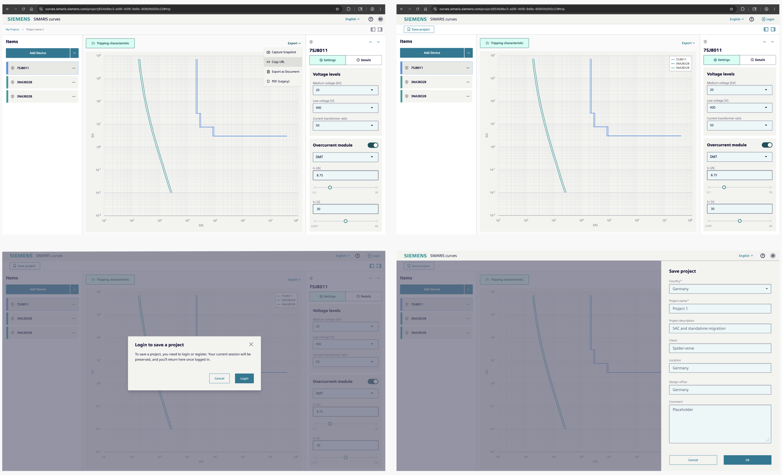
Shareable URL carrying full calculation state. PDF retained as secondary export for users who need a formal document.
Engineers weren't trying to document, they were trying to share. Those are fundamentally different intents. A PDF requires downloading, opening, and sending. A URL requires one copy.
Significant architectural change like calculation state serialised into URL parameters. Required backend alignment, security review for unauthenticated access, and a full redesign of the export flow.
An external engineer with no account receives a URL, sees the full curve view, and can save the project directly after login with session preserved. Share intent replaced document intent without removing PDF for those who still need it.
Details that held the
decisions together.
Smaller choices made at every level of fidelity - each one visible to engineers who use the product daily.
Toggle switches replace expand/collapse arrows for settings modules.
An arrow tells you nothing about state. A toggle shows you immediately the on or off state, no interpretation needed. The accordion pattern required engineers to infer what expanding would reveal.
Appreciated by SMEs in first review. No explanation needed in testing.
Numbers that came
after the decisions.
Measured three months post-launch. Source: production logs and SME feedback from 26.1 deployment.
Daily Active Users
New landmark reached week of 22 Apr 2026, on production deployment.
Source - production log data
User Growth
Increase in daily active users from desktop baseline of 90. Engineers across Europe.
Source - server log files, 3 month period
Task Speed
Device selection and curve tracing per expert user feedback across pilot sessions.
Qualitative - measurement planned next release
What engineers said
Retired
Native mobile app
Primary Experience
SIMARIS Curves Web
"We just reached a new landmark last week with more than 200 unique users per day."
Lead Architect, On 26.1 production deployment, April 2026
webscu-prod — users per day
Peak: 212 · Apr 22internal (0) / external (1) users · source: production log, April 2026
B2B Outcome
Five things this project
taught me to keep.
Not everything that was hard was wrong. Some constraints shaped better thinking than freedom would have.
Clarity over craft.
In a large organisation, being a good designer is not enough. The real leverage is explaining what the user needs without jargon, without ego. It took months to understand this domain well enough to speak in a user's language. Once I could, decisions moved faster.
CommunicationDocument the why, not the what.
No direct user access meant every decision was an assumption. Making those assumptions visible and documented per sprint, became the project's institutional memory. It helped SMEs validate faster and helped the team build with more confidence.
ProcessConstraints are part of the brief.
A third-party plugin powered the graph canvas. Understanding the Highcharts constraints mid-sprint reshaped how I scope technical discovery. Now it's the first conversation, not the last. Constraints understood early become decisions made well.
TechnicalReuse before you invent.
Every new UI pattern had to be justified to the frontend architect. That friction made me a stronger systems thinker. In enterprise products, consistency compounds across every release. Restraint is a design decision and often the right one.
SystemsYou design for the person and the organisation.
Individual engineers used the tool. But the organisation decided whether to scale it. Features like responsive design and URL sharing served both and that dual lens now shapes how I approach every enterprise project I take on.
EnterpriseNext Project